![[Last]](../../bar/last.gif)
![[Up]](../../bar/parent.gif)
![[Next]](../../bar/next.gif)
![[RSS links]](../../images/rss16.png)
ImageFileGadget
The ImageFileRender stack provided a good deal of functionality in Select 2 which wasn't really being exposed. Independently, I had added the means to change the window furniture ordering, allowing the close, iconise and other buttons to be moved around the window to meet a user's preference. The idea was to allow the system to use an ordering which was more comfortable for the user, which might mean matching the orders used by other Operating Systems.
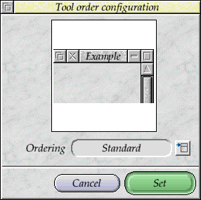
The Tool Order plug-in was pretty ugly.
Initially the configuration tool for the tool ordering was a simple set of
options, allowing users to select the style they preferred. The tool only had
options for a couple of the styles that seemed useful at the time. I wanted
to show an example of what the style would look like when it was used. The easiest
way to do that would be to have an image that showed an example of the
order in use.
I wasn't really keen on putting a whole bunch of image rendering and redraw code into the configuration plug-in, as it was something that is really far more generic than that. Instead, I created the ImageFileGadget, which would be able to render an Image File within a region. At this time - late Select 2 development - the redraw handling hadn't been added to the Window object (see the later ramble on Gadget features), and the RedrawManager module hadn't been integrated yet, so it wasn't possible to use either of these to handle drawing the images within the Window.
So instead, the new gadget used the nested window method that had been used by the TextGadgets module. The ImageFileGadget would create a nested window where the gadget would be, and could perform the necessary redraw of it. This is one reason why the Tool Order plug-in looks a bit of a mess compared to the other gadgets - it shouldn't really have a white background and border around the example image. It looks a bit ugly, and I had intended to return to it at some point. It was not updated in the Select 3 time, and the later 32 bit work meant that it wasn't even looked at. Oh well.
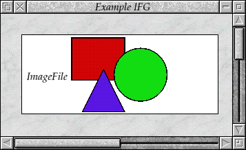
The placeholder image inside !ResEd.
In any case, the ImageFileGadget itself started out just able to render an
image in the 'fit to region' with a few pixels of border, and without much
in the way of configurables. It didn't even render a place holder image
when it was used in !ResEd - just writing 'ImageFile' in the
place of the gadget. This was soon changed to be a generic square, circle
and triangle, as a DrawFile which would be drawn to fit the gadget whilst
you were editing the window. It wasn't particularly complicated as an image,
but the purpose was to provide an representation of what the gadget might look like
when your program was running.
There was a test application which was written to check the behaviour of the gadget matched the intention, and didn't break badly. It was not a complicated test application - not quite as complex as the fun that went in to testing the Scrolling Lists - but it did have a few options to work with. The ImageFileGadget was (I hoped) going to see quite a lot more use in the future as one of the more featureful of the gadgets.
The gadget was updated to pass through the render type to the ImageFileRender gadget, which allowed the number of pixels in the border to be changed, and the scale, or even for the image to be rotated if require. Initially the gadget always started out with a border on its window, but this could be disabled with the Nested Wimp, so the option was available to disable the border.
The colour mapping was also able to be used - any colour map entry could be used by the gadget, which allowed the ColourMap module to be used to perform effects. Fading the gadget would be applied on top of other colour mappings to ensure that it always looked consistent. This introduced an interesting question, though. Whether the background of the gadget should also have the colour map applied to it. To match the behaviour of normal icons, it really should. However, this might not be the intention of the region - the fading might only want to take place on the image itself, and fading the background might be the wrong thing, stylistically, for the application using it. Consequently, the option to apply colour mapping to the entire gadget, or just the image, was available as well.
The ability to change the quality and the index of the image in the Image File were also available, although these weren't really used - they were later exposed in the !ImgViewer application (as discussed in the Graphics Conversions ramble). Whilst working with the test it became clear that any errors reported by the ImageFileRender module would not actually be passed back to the application. This wasn't a big problem for the cases I usually dealt with, but was something I intended to fix later.
The problem was that the errors wouldn't (usually) be detected until the render was performed, at which point it was outside the application's control flow. One possibility was to report the error through the generic toolbox error reason, but this would probably just end up killing the application, or being reported directly to the user. I had intended to add a new ImageFileGadget event, indicating any errors that had occurred on the redraw after changing parameters (and wouldn't be reported again until the parameters were changed). This wasn't needed yet, so it was still to be implemented.
However, the errors were printed in the gadget so that it was at least clear that there was a problem with the redraw. Not exactly friendly, but better than nothing.
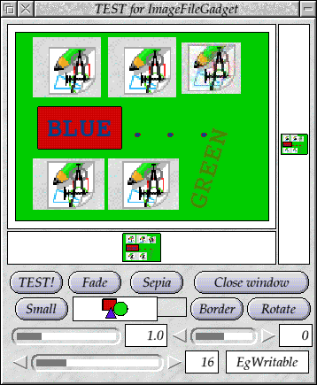
The test application allowed many of the operations to be tried out on some simple images. The default test image had a DrawFile with a number of types of object in it - sprites in paletted modes, deep modes, with and without masks, a JPEG, some shapes in different colours and both plain and rotated text. There were other test images - the ubiquitous (in terms of testing the graphics system) 'More Than Meets The Eye' DrawFile, a JPEG and a raw sprite file - each of which could be selected by clicking the 'Test' button.
The image shown was repeated into a very tall, and a very wide, gadget within the same window - testing that the rendering worked when the regions were smaller. The 'Small' button also allowed an additional gadget to be redrawn at smaller and smaller sizes to test that the gadget itself didn't fail, especially when there wasn't even an image associated with the gadget. Sliders allowed the gamma correction to be applied to the image (on top of the 'Sepia' and 'Fade' operations which were available on buttons).
Another slider allowed the size of the scaling to be controlled (0 being 'fit to window, with border from the slider below', and other scales allowing the image to be scaled up or down, using the different transformation types). The rotation in the 'fit to window' mode could be incremented using the 'Rotate' button.
You could also click on the window and a report of the position would be made, indicating the actual click position and the position within the image itself. Or you could drag the image to test the scrolling operations.
I've got no idea what the writable icon did, but I'm sure I intended it to do something. With the test application, and the !ImgViewer application, all of the operations that the gadget provided were exercised (I believe), so it should have been possible to provoke any problems that anyone found. During the development of the !ImgViewer application, tests were added to the tool to ensure that they could be reproduced in the future as well.
Testing these operations manually was a bit tedious, but there wasn't any harness to automate the tests. Testing in this area was lax across the entire Wimp interfaces, not just Toolbox Gadgets. It would have been useful to provide a way to test such things, but aside from some basic tests in the benchmarks, there wasn't much done. A lot of testing in the real world involved system integration testing, and there are a lot of tools available to aid in these. However, they are usually for other Operating Systems, and wouldn't be suitable for RISC OS testing - which isn't to say that some couldn't be tailored to work with the system given a bit of work. Of course, if they cost money that immediately discounted them as an option.
In general, the ImageFileGadget was very useful for the specific task it had, and it became a core part of the gadgets that were distributed with the OS. It had quite a few limitations, and needed to be tidied up in some areas, but it was well in advance of its current use - it could do far more than it was currently being used for. Only when people tried using it in ways that hadn't been considered would there be other problems found and features be needed.
Scrolling List
When we were releasing Select 2, I wanted to include in the installer a list of the components and version numbers that were being updated by the installation. The first Select release had included a Manifest of the components that were installed, so it was relatively easy to produce a list of the changes between it (the currently installed set), and the update (held in the installation archive). Eventually this would be tied to specific changes for each component, but initially I just wanted to show the changes.
The scrolling list gadget presented the simplest means to do this, but it only displayed single items, not columns of items. One possible solution would be to manually manage the list, or to use multiple scrolling lists and cause them to scroll together. Neither appealed as useful solutions. Instead, I chose to extend the scrolling list such that multiple columns could be supplied per row, allowing the name, old version and new version to be shown easily in the list.
The scrolling list interface only accepted strings, and rather than changing the interface to allow for arbitrarily addressable cells (which I had planned to do in a separate gadget), I chose the simple extension of using a 'tab' character between each column in the row strings. As the rows were added, the size of each column was calculated and the display updated. This was a little inefficient, but was fixed later. The initial version was good enough for the installer, but there were still a few things to do.
To make it possible to show the list as just a list for presentation, rather than to make selections from, I added an option to make the list just for display. I briefly considered that the 'faded' option mirrored this, but it is not the same thing - 'faded' means that the gadget is unavailable, which is different from a gadget which is used for display only. Additionally, 'faded' gadgets followed a set pattern for their colouring, in line with the new Wimp shading algorithm (actually, the gadgets all used the Wimp to perform the shading).
Around the same time, I also added support for radio (or option) icons beside the rows, which made it easier to see which options were selected. It is more in keeping with how other selections work in RISC OS, so makes more sense to present the options in that way. The change between radio and option icons was based on whether the selection was allowed to have multiple items or not.
With the list showing different columns, which resized as they were added, it would be useful to know what the columns meant. I added support for column headings, which could be set for each gadget. This was just a row at the top that you couldn't select, and which had different background and text colours.
When gadgets are drawn in the !RedEd application, they are actually plotted as plain icons, usually. Other redraw can be done, but generally the presentation is as just icons. The Text Area and Scrolling List gadgets, though, looked identical - a white box with a grey rectangle showing where the scrollbars would be (approximately). This made it hard to differentiate between them - so I added a simple text label to say what type of gadget they were. The actual drawing of the gadgets in this case is entirely performed by the gadget module, so there is no update necessary for the editor itself to make this sort of presentational change.
The Scrolling List itself is managed as a nested window within the parent window. As such, the 'gadget' is a little different to the others - obviously it cannot be moved with SWI Wimp_ResizeIcon, and it doesn't follow the colouring scheme of the parent window. The shading algorithm which had been added to the Wimp in earlier changes wasn't obeyed by the module, which meant that if you had a white Scrolling List gadget on a blue window background it wouldn't fade towards blue when the gadget was faded.
Fortunately, the exported colour mapping functions which the WindowManager provides could be used to ensure that the colours used by the window match those used by the fading algorithm.
The Scrolling List gadget had been used in a few applications, and it became obvious that there were other problems. Generally the TextGadgets module provided a lot of nice features but those features were pretty buggy. Christopher Bazley did quite a bit of work to tidy up the Text Area gadget (including mistakes that I'd introduced), which made it significantly cleaner and safer to use.
TextArea gadget
The same module also provided the Text Area gadget. This was a (slightly) richer text input field that could be used to input blocks of text with line breaks in, unlike normal writable icons which only had a single, limited line. Whilst it was a little nicer, its requirements when it was created by Acorn were (I believe) to support one of their applications - probably Java or the mail client.
Internally it was a bit of a mess, and there were numerous problems with
the memory handling and even the plain editing of text - it was possible
to cause it to corrupt memory by deleting text in particular ways. A few
of these I fixed as I went along, and Chris Bazley fixed a whole lot more
when he worked on it. Rik Griffin had also fixed a few things along the
way as well - it seemed that whenever people looked at the gadget they
found it to be a difficult proposition to work with  .
.
However, over time it did improve in both its stability and functionality. Operations like clipboard were provided through key shortcuts and the caret operations that had been defined, but never implemented, were completed. Auto-scrolling was added, so that the regions could be selected more easily, and the selection regions were made a lot more efficient (especially when there isn't anything happening).
Although I had, early on, understood what was going on with a lot of the memory handing inside the Text Area, it slowly faded and I couldn't fix some of the problems that we were seeing (at least not without reacquainting myself with how its memory management worked). I seem to recall that it would convert each line into a sequence of SWI Font_Paint operations in memory, and manipulate the whole text area like that. I could be wrong, as it's been a while.
Fortunately, by then Chris Bazley had been working with it and understood it a lot better than I and so provided a lot of fixes for broken behaviour. I'm certain that he fixed things that I had broken by accident or through misunderstanding as well.
There are a few issues with what the Text Area gadget is. Primary of these is that the Text Area is limited in that it is intended to provide only multi-line text input (and possibly display). It is not designed to provide any greater functionality, such as colouring, different fonts, decorations such as underlining, or embedded images. It is intended for direct display and editing, and not tailored to show, for example, continually updated data (as might come from a log or server). Its implementation as a nested window within a window precludes it from having any other gadgets overlaid on it (such as images, or a watermark).
It can (and should) be argued that all these types of things are specialised features which should be provided by a dedicated gadget. A rich input gadget should be separate from the plain text gadget, in that it can do a lot more but is far more heavyweight to work with. There is the counter that if the gadgets are just doing the same thing so why should they not be the same gadget. I lean towards the two being separate, partly because the more specialised gadget ends up with greater complexity, and might not be as easy to get working, and the original gadget 'works' (to some degree - and I'm sure Chris would have something to say on that!).
For display purposes, the 'HTML gadget' that I had hoped to get working would have been an interesting tool. As people showed me various things which they were working on to get feedback, I had seen a few interesting things over the years. One such application that someone was working on was a XML based renderer which could apply general CSS styles to produce a set of very differently styled documents. Very interesting and quite neat at the time (I can't say who it was or what they were doing it for, but saying this after these years probably isn't a problem).
More recently I saw a rather nice text based tag cloud displaying application that someone had written, which would make a very nice toolbox gadget - albeit quite specialised. Over the years, I'd talked about the idea of taking the terminal bits out of !Nettle (obviously with the permission of the developers) to produce a ZapRedraw based ANSI display, as a toolbox gadgets.
On the odd occasion that I had been tempted to rewrite !JFTerm, I had considered rewriting my DispLib as a Toolbox gadget. I am certain it could be a lot more efficient now than it ever was before, and it might even be used by people.
There are many different ways that you can show text (and more when you add in editing and data transfer). At the very least, a gadget that allowed different text colours, and maybe underline, should have been produced. The fact that it had not been addressed wasn't so much that there was no need, but that the need was worked around - or wheels were re-invented.
Disclaimer: By submitting comments through this form you are implicitly agreeing to allow its reproduction in the diary.