
Mapping
As I became familiar with the game engine, I began looking at the various ways that I could extend things. One of isolated sections that could be updated was the game map. Normally this would be displayed centred on the user, showing just the player and the walls that had been seen. If you were cheating, however, you could see the entire map, or even see the monsters and objects as triangles.
I added an extra mode to the cheats which made the monsters appear as coloured triangles, collectable objects as stars in different colours, and missiles as flying triangles. It looked pretty good and you could play the game relatively well like that, although it wasn't really as fun.
On the main map itself, I added some extra details. The number of secrets that had been found and the number of monsters that were left alive were listed. These could be configured on and off in the main menus, so you could still play in ignorance if you wanted. The way that the text controls were handled as part of the redraw made adding these extra features quite simple. The engine had been designed with flexibility in mind and these changes were pretty easy to make.
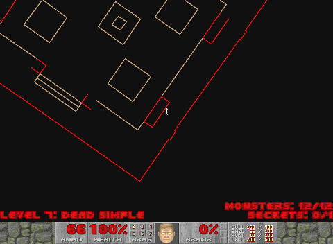
The normal map had the option to add extra information about the level - the number of monsters and secrets.
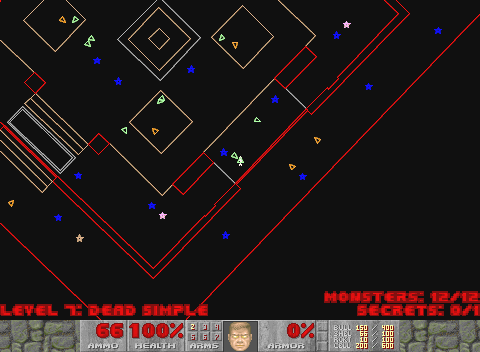
When the map cheat was enabled there were different levels of extra stuff that could be shown, including the bonuses, all the monsters and their projectiles.
As well as adding to the map itself, I learnt more about how it worked whilst playing with the Heretic source code. In Heretic, they had changed the map so that it could be drawn with anti-aliased lines. This made it look Less blocky, and far nicer (in my opinion). Moving the line drawing code back into Doom was pretty simple, although it required that some translucency tables be calculated in order that the smoothed edges blended to the surroundings.
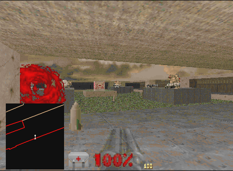
One of the things I'd felt that the game needed was a picture-in-picture map. Well, when I say that I felt it needed, I actually have a feeling that it was one of the many things that Andrew suggested as we bounced test versions back and forth. When you picked up the map item, it looked like a little hand held device, and I had always imagined it being in your left hand whilst you attacked things with the weapon in your right. So adding a map as a picture-in-picture was logical to me.
Initially the map was drawn with a solid black background, much as it had been when full screen. This looked a bit tacky, though, when you had zoomed the play area down - it overlaid part of the background and looked a little like someone had just plotted a black map over part of the screen.
To make it look a little cleaner, I extended the edge of the view area around the outside of the map, as if it had been inset into the background as well. This looked far better, although was silly a little artificial where the map overlaid the main playing area.
To go with the picture-in-picture map, I also added a little proximity sensor, similar to that in Aliens, just to give things a little more authentic a feel to some games. A 'ping' would be sent out, and when it bounced off an bad guy it would give an audible ping, and another ping would be sent. The pitch would be lower if they were further away, and higher if they were closer (probably it should have depended on the direction they were moving, but it felt right like this). So the effect was lots of high pitched pings close together when the monsters were just around the corner, and low pitched, spaced out pings if they were further away.
If you had the picture-in-picture map showing, the propagation wave would be shown in green as an expanding circle (actually the response for the wave, but the distinction isn't important). I thought it looked quite cute.

Picture-in-Picture overlays the map over the game area.
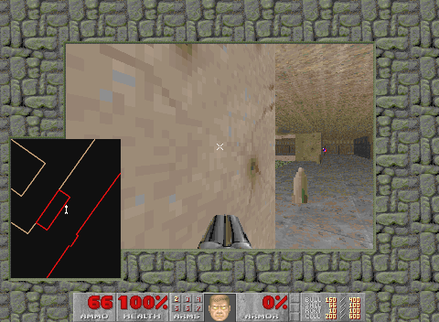
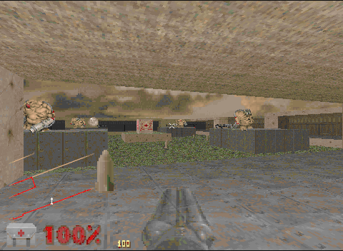
If you resize the screen downwards the border which runs around the screen area also goes around the PIP.
Adding the blending tables also made a few other things a lot easier. With blending tables (75% and 50%; 25% comes for free as it is the inverse of 75%), more things could be made translucent. When you were playing full screen, normally you wouldn't be able to see your health or ammo levels. They weren't plotted because they would take up space and in any case would obscure the display.
I'd become quite used to the Heads-Up-Display that Half Life used, and its health and ammo measures, so I wanted to do the same in Doom. Because of the blend tables, it was easy enough to make these appear at the side of the screen as transparent icons. And why have the black background at all? If the map is being plotted with smoothed edges, it doesn't matter what they're blending too - it doesn't need to be black.
So it was simple enough to make the map itself transparent, and just plot the lines. Initially the lines just stopped at the edge of the mapped region, but this looked quite artificial as well, so I made them fade out at the edges - a trick that had also been used in Heretic.
When the PIP was used in full screen, the Quick View health was pushed to one side.
When the overlay map was used in full screen, the Quick View could be shown in the same space. And the map fades out at the edges so that it's not so jarring.
With translucency available, I could start adding flags to objects so that they would be plotted translucently as well. The water bottles were able to be made translucent, and fireballs too. The Imp and Cacodemon's fireballs were one of the most expensive translucent effects, together with the plasma gun. A large group of Imps could easily fill the screen with fireballs, and when translucent, they would require at least twice as much processing as the screen had to be read to work out what to blend to - and the screen memory was uncached in some cases.
The plasma gun was similar, as it had a very high rate of fire and if the plasma explosions were close to the player, as they might be if you accidentally fired at a close wall, the game could really slow down. I added a special mode for the plasma gun to allow it to fire a spread a plasma balls in 8 directions in front of you, which looked cool and was great for crowd control... but it depleted your energy 8 times faster, so you couldn't use it for long - and it was cripplingly slow when you had the transparency enabled. Originally it fired in only 4 directions, but after a few goes with it Andrew suggested increasing the amount of fire.
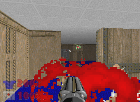
Fireballs are normally quite solid things.
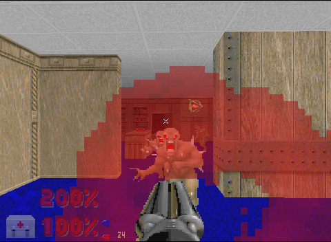
With the transparency option enabled, fireballs and other items which should be see-through become transparent.
Demos
On Christmas morning one year, after opening my presents and whilst there was some very dull television on downstairs, I added some little snowflakes falling to Doom, and mailed a copy to all my beta testers. Because the sprites I drew were pretty tacky, it doesn't look all that great. If I'd been able to get it done I wanted to tint the floors white, or maybe give them splodges of white in regions, and make the walls whiter towards their base. However, both those were too hard for a few hours on Christmas day, so it was just the snowflakes. It's still pretty cute, I reckon, albeit silly.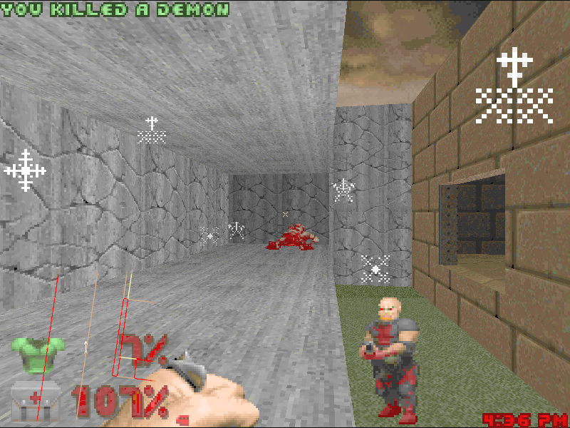
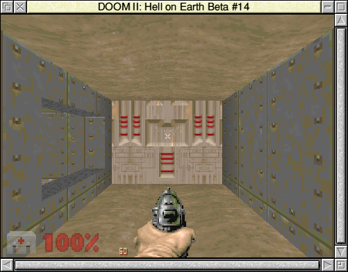
Later I produced a 32bit version of the game, which was pretty experimental as there is quite a bit of assembler in the source and it's quite a lot of work to check it all. At the time I was quite busy making the rest of RISC OS 32bit safe, so I fit the changes in as a side project. The main game itself linked with StubsG so that it ran everywhere without any special components being installed.
I had produced an automated installation tool at the time as well, so I put the whole thing together in a single self extracting archive. The tool would show you the license and then decompress all the files to a directory of your choice. I was really pleased with the way that the installer worked, although it only went to a few people at the time.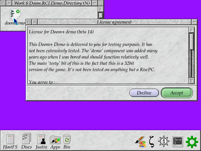
And it ran on 32bit systems, too. (Animated version (2236K))
One of the experimental bits that made it into a demo was the alternate water effect. For the initial demo, the effect applied to all the planes - ceilings and floors. Doom originally had animated floors, which were used to show water, lava or other liquids. However, the 'animation' consisted of just a few frames and didn't really seem to flow very well. I had seen Quake's use of water effects and it was significantly better. Whilst Doom couldn't really provide a proper above and below water effect easily, changing the behaviour of flats was easily achievable.
Essentially to make the water appear to flow back and forth you need to give it a smooth moving appearance. It's not possible to give the flow a direction because there's no indication in Doom of the way in which the water should go - and you would have an effect that pushed water into walls if you picked an arbitrary direction. Instead I chose a simple effect, based on a sine wave.
The principle is very simple - use a lookup table for the source data location within the flat data, which applies an offset to the data in a sine wave scaled in amplitude by the time offset. Apply the effect in one direction and the image will appear to bunch up and then stretch out again. Apply in both dimensions together and you get a reasonable effect. It might not be perfect, but it did a quite nice job.

I never finished the water effect; it was a bit slow really, and it was difficult to find the places where it needed to be used. But it did show off the nice effect, and I might have made it a real feature if I'd spent any more time on it.
Menus
The menus in the game were originally fixed. They could only trigger fixed actions because the graphics were just a block of text. For example the menu item 'Load Game' was just a single image for that text. I wanted to create more menu items, to allow the configuration to be performed in game. I didn't like the idea of using these fixed images, as it made the menu quite inflexible.
I sprite up all the graphics into their component letters, and built a new set of sprites for these letters. In some cases there were letters missing, particularly in the upper case letters, so I needed to create some new characters in the same style as the originals - it's not that hard as most can be based on other letters. Once this was done, I changed the menu routines to refer to the actual text to print, rather than the sprite to plot.
The disadvantage of doing this was that any PWAD which provided its own representation of the text would not appear as the author intended. I didn't consider this important enough to worry about, though. It gave me much greater flexibility for the menus themselves.
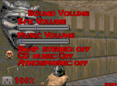
One big area that I added things to was the options menu. Originally the sound options had been referenced from the top menu and that was about it, but there were a lot more options available in the game than it had ever had before.
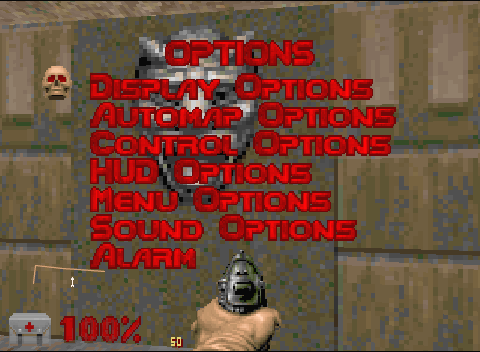
The menu system allowed for sub-menus, and was easy enough to extend so that the menus showed other gadgets. Each menu item could display a value, slider, or number, and had limits. The sliders could be limited in size, and number fields could be incremented through the left and right cursors.
Each line had an action and render function, which would be called to either perform an action based on a key press (eg left, right, select), or to redraw its content. The different gadgets could be attached quite easily by adding their function calls to those that were called when the function was triggered - you might implement a similar thing using different objects in C++, but it was easy enough to just do with function pointers in C.
The crosshairs configuration shows off the sliders and the new colour patch that I added so that you could see what colour the crosshairs would appear as. They could be different shapes - straight, cross, an animated dot moving inwards, or an oscillating dot which marked out the cross position. The animated crosshairs sounded good at first, but in use they were really quite annoying.
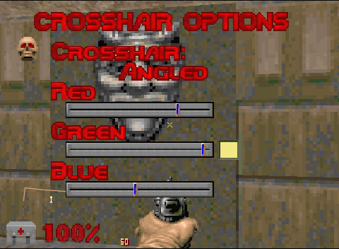
Marvel at the reused slider bar, and the new colour patch.
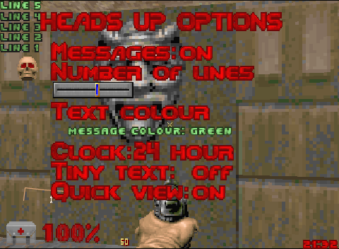
As well as the controls for the menu, there was the beginnings of a multi-line gadgets in the source. It wasn't really usable as it stood, but after a bit of fixing it worked quite well. Making the recent messages appear as a multi-line output at the top of the screen meant that it was a harder to miss a recent message.
As the messages were used in the Deathmatch modes - which I enjoyed playing with my brothers - you wouldn't want to miss a taunt from your opponent as you died. The messages would stay on the screen for a few seconds each, with new messages added to the top, and old ones being removed after the delay. The number of lines were configurable, as was the colour. Coloured text was actually very simple - the code already existed to translate the palette, as this was required for the multi-player rendering of the marine and the messages from other players.
The top most (most recent) line was always printed in the brightest colour, with the other messages darkened down. I thought it looked quite good, as it focused you on the most recent, but the others still hung around for you.
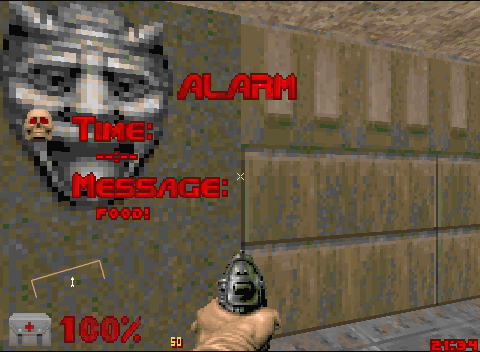
I added a small clock in the corner of the screen as during the coding and testing of the game it was very easy for me to lose track of time.
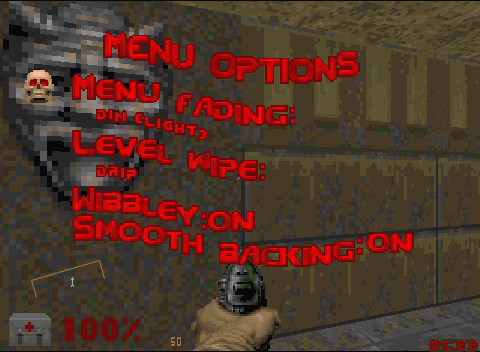
Even the menu itself had a little bit of a work over. If you brought the menu up in the game, it could be distracting to have the game behind the menu - and if you were playing a multi-player game it would keep animating as well whilst you were in the menu. To try to keep the focus on the new menu, I added the options to fade out the background; either the title screen, or the game that was playing would be faded using a number of different methods.
A light fade or a dark fade could be applied, using the blending tables that were generated for the map previously, blending the screen towards black. Or it could be combined with a stipple effect, which was cheaper on processing, as only the pixels that remained would need to be blended. The rest would just be black.
It was a little gimmicky, but I went one further, adding a very silly wobble
to the menu text. The main text itself was made up of letters, so it was
simple enough to make it move sinusoidally. I think I saw the effect in the
game Descent and thought it looked really bad, and so I had to reproduce it
![]() .
.
At the ends of levels and sections the screen could be configured to 'drip' the menu off the screen, uncovering the game, or to slide off the screen. The drip was quite expensive in memory and processing, and the slide was less costly. If neither worked, it would just fall back to flipping straight to the game, which didn't look as nice, but at least worked.
The sound menu was pretty similar to the original, although I added dedicated CD sound. Instead of playing the MIDI music, the game would monitor and control the CD audio, playing tracks off the CD to correspond to the level being played. There was an audio soundtrack CD you could use with this, although I preferred to just leave normal music in there.
I did try adding a little more atmosphere to the game by making the volume vary according to the action. If there were shots fired, or you got hurt, the volume would increase for a moment or two, before settling back to its previous level. This applied to both the CD and MIDI music. It didn't work too badly in tests, but I don't think it was really noticeable in the game, which is a pity. I'm almost certain that this was a request from Andrew, and I'm a little disappointed that it wasn't as effective as it first seemed. I liked the idea of the music changing to match the action, and it didn't really work as well as I wanted.
The clock I mentioned earlier was not enough. I missed things. So I decided to add an alarm. A single alarm could be configured, along with a message. Every second that the alarm matched the current time, a 'tink' sound effect would be played and the message would appear on the messages bar. At least this way I'd remember to watch Stargate, or to make myself some tea!
Multi-player games
I'd written the network for the game some time before getting access to the game itself, but I couldn't change the actual mechanics of the game until I had the source itself. The games themselves were pretty fixed in their rules, although there were 3 major types of game that you could play - cooperative, Deathmatch and Deathmatch v2.
Cooperative games were just the single player game, but with other players helping you out, possibly independently. The Deathmatch games kept track of the player's kills but you could play through the levels, with all the monsters, until someone reached the end point. The 'v2' game was slightly different in that weapons would respawn after a period, and killing yourself affected your kills negatively.
The network game configuration on the front end was significantly expanded to allow more options to be configured, many of which were previously command line options, but there were significant new options as well. The names of players could be configured - which meant that so long as the player names were set properly, you could tell who was who (if you configured the floating names on) and the status lines told you who killed who. The final scores table also used the player names to show who won the levels.
Another way that things could be configured is that each player could set their own name, and these would be transmitted to the other players. This made it a lot easier as all the players would be named correctly - it wasn't always easy to know which player was which otherwise. The naming, along with many of the new options, was a !Doom+ only feature, and couldn't be used if you were playing against a PC or Linux version of the game. The game would detect this during the negotiation and exit with an error if the wrong configuration was used.
The front end allowed a lot of configuration options, which were available to the host system, and would be distributed when the game started up, along with the name. You could configure whether monsters were present in the levels, and whether they would respawn if they were present, which changed the dynamics of the level significantly. A particular favourite of mine was Doom 2, level 7 ('Dead Simple'), which was a square a path around it, populated with spiders and a few rocket guys. It made a quite good Deathmatch level for even just 2 players, and with the respawning objects it became more fun.
Killing players was obviously good for your score, but I'd played the Half Life Deathmatch games, and really liked the fact that the weapon that was wielded by the killed player got dropped. I added this feature as an option (as well as a 'drop a random weapon' option), and this made the chases around the map a little more interesting. Not only did you score the points, but you might end up with a better weapon for your troubles as well.
The weapons themselves could be controlled from the front end as well, so that certain weapons were removed from the game. If you had a player who was particularly good - or nasty - with a given weapon, you could disable it entirely. Or you could disable the weapons to change the balance if you felt that they were unreasonably powerful.
Disabling the rocket launcher and BFG was a good game setting that my brothers and I used. It meant that some secret areas weren't useful as they hid a disabled weapon, but it meant that you couldn't be killed from great distance as easily. Another good example was to disable everything but chainsaw and berserk (and you always had the pistol enabled), as this brought the game to close quarters.
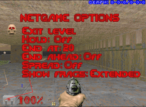
There were a few extra options that were added for level ending as well. The level could be configured to end after a set number of kills, or when a player was so many kills ahead of the other players, or even to be locked to the current level. These options (and things like whether the special plasma gun spread field was activated) could be configured within the game through the network menu, although the whole 'network options' menu could be disabled if you didn't want the configuration changing.
I added an option, like many other games, that you could configure that the player was invulnerable for a short period after they respawned. This was mostly useful to stop players who camped near the respawn points, or just happened to be nearby when you respawned and would otherwise get a very easy kill.
It was also possible to configure a score table which appeared in the top
right of the screen, in the player colours. This could be either simplified
number of kills, or broken down. The most complex (shown below) displays:
level kills - level suicides + level monster kills / total kills - total suicides + total monster kills
which is probably far more information than most people care for, but looks
pretty neat when you've been playing for a while.
Graphics conversions
!DoomGFX
I wrote a couple of conversion tools for creating and decoding the Doom graphics, as well. I'm pretty sure we bundled these with the !Doom+ package, as they weren't really that impressive or useful. They did do a reasonable job though. You could convert any of the sprite formats to Doom graphic lump files, in the different formats that it supported.
Even the deep sprites could be converted to Doom sprites, albeit they would be quantised down to the 256 colour palette that Doom used. The tools could also created graphics for Heretic and Hexen, using the slightly different palette that they required.
From the look of the code, I originally intended it to be able to handle the conversion from Clear files as well, but never actually implemented it. Later, when I wrote the ImageFileConvert stack, a Doom sprite converter was released as part of the SDK which allowed you to very easily create the graphics through the standard conversion process - and you could just save the image out from !Paint directly.
Cookies
There were a few hidden cookies in the game, some of which were really
obvious, and others which I had forgotten. One that I'd forgotten is the
'moon on a stick' cheat - type that without the spaces and a sequence of
messages would appear in the console window. If you used the switch
'-rd1' on the command line, the messages would change to the
opening lines from Red Dwarf.
Unfortunately, some problem with the decoding meant that the last character on each line seems to be corrupted. Nobody that I remember reported it as a bug, so I guess either nobody found it, or maybe they did but didn't mind.
I think there was a Helen Rayner cookie as well, but it didn't seem to work when I tried it out. The beta versions also had a memory dump keyword which would write a dump of the heap blocks that had been registered.
A5000 version
One request that came in whilst I was developing !Doom+ was for an A5000 version. The machines were still very popular - I still had one - and, although I was keen to avoid continuing support for older systems, I still thought it was quite feasible to run on such systems. The main problems with running on the A5000 was the lack of memory; this had been avoided in the Pirate version by removing the sound support and limiting other parts of the system.
Because the game was far more resilient than it had been, it coped better with low memory situations and, although some of the tables that were created used more memory, they sped the game up significantly. It balanced out quite well. For reasons I'm not sure of now, I continued using the dynamic areas for the main heap memory - I'm pretty sure it could have been allocated out of the application space, and as it was a static block it wouldn't fragment. The total memory on the base A5000 was 4MB, so trying to fit a heap in it was going to be a bit of a push. Some levels could end up thrashing the heap, constantly reloading data because the data needed to render the scene couldn't be fit entirely into the heap.
But anyhow, the A5000 version had a choice of areas for the main heap, primarily the RAM disc area or the system sprite pool. The sprite pool was more reliable as it didn't get accessed by anything if it wasn't actively being used. The palette handling changed slightly, and I went through a few iterations of palettes, to try to make it match the palette better. The Pirate version had done a very good job, by selecting a custom palette for the 256 colour mode.
There was still the problem that the palette itself had to vary when you were hit and programming it was slow on the A5000, but it was pretty doable. The screen wipe effects were pretty difficult to support - the dripping screen required multiple copies of the screen, which was very difficult to support on the A5000. This necessitated the creation of fall back code that would revert to a simpler wipe, or just cut to the new frame.
I came up with a sideways sliding blinds effect, as a simple transition from one frame to the other, which took much less memory. If there wasn't even enough memory for this, it would just switch to the new frame.
Configuration
The configuration in the desktop was changed significantly in the front end, and I documented most of the configuration options on the Doom section of my website. Behind the scenes the configuration reader was reworked to make it a little more friendly. Previously configuration files were just lists of the options and their values, which was fine if you used the front end or knew exactly what values they could take.
Internally the configuration file was updated to include a definition of the limits on the value that the configuration could take and a description of the configuration entry. The limits were used to validate the configuration centrally, and the description was written out (with the limits) as a comment before the item when the configuration was written out.
Any configuration options that were read in but were not understood were also retained, listed at the bottom of the file. The idea was that the configuration files for the Doom versions were pretty much interchangeable. You could drop an old configuration file from Doom in place of the one the front end had produced and you would get all your old settings. Or you could use one from another Doom engine and it would make the best of it.
I have a feeling the idea came from Boom, which did the same thing. I doubt
that many people cared too much that I'd done this, but it felt a lot better
to me. I like seeing comments ![]() .
.
Disclaimer: By submitting comments through this form you are implicitly agreeing to allow its reproduction in the diary.