![[Last]](../../bar/last.gif)
![[Up]](../../bar/parent.gif)
![[Next]](../../bar/next.gif)

![[RSS links]](../../images/rss16.png)
WindowManager and IconBorders
Whilst I was at Pace, I worked on some of the products for STBs which had more interesting interface designs. In particular, to make the designs effective the browser button styles were quite different to those that we usually see on RISC OS - from the way that radio and option buttons worked, through to the action buttons and group boxes. As these were implemented within the browser, they made for a slightly different experience.
One button style stuck in my mind - each button had one rounded end with a coloured border. It made them look quite distinctive. I thought they were pretty neat anyhow, but the idea of changing the way that the buttons worked in general in RISC OS started from there.
In much the same way that the ToolSprites were configurable by users, the buttons should be as well. Unlike the ToolSprites, however, I wanted to stay away from providing building block sprites to construct the edges. Mainly this was because I didn't feel, at the time, that the different styles of buttons would be adequately supported by such construction.
To make the process easier, I continued the separation of the
WindowManager
functions to extract those functions related to icon border rendering. The
Wimp was really quite nasty in having a set of numbered source files, eg
s.Wimp04, some of which contained related functions, but
many of which had been extended arbitrarily over the years, so now
contained a mix of different operations.
I had been separating these out - picking out sections of common functionality and moving them into named files - in the Wimp, the Filer and the Kernel (probably others too, but I can't remember which ones). The icon-bordering had to be picked out of the general icon rendering code, into little functions that just performed the rendering necessary, together with support functions that were only used by that code.
Once the functions that were performed had been isolated, these could then be moved into filters, in the same way that many of the other Wimp extensions were provided. Initially there were 4 different filters, one for each of the border operations that needed to be provided, but this seemed far too fiddly, especially as clients would probably be required to register all the filters in order to function.
The 4 operations were relatively simple:
- drawing the border itself
- filling the inside of the border
- reducing the bounding box to take account of the border
- manipulating the colours for the icon
Because the operations would be performed in a sequence, it was necessary to have them separated - filling happened first (if the icon was filled), then the colours would be manipulated, and the bounding box reduced for the content, the content would be rendered, and finally the border would be drawn around the outside.
The sizing operation ensured that the actual text in the icon (and/or sprite) would be drawn correctly - any centring or alignment would be performed on the reduced box, not the original box. This might not seem too important for most borders, but if the border has one side larger than the other, or maybe a thicker top or bottom, the content has to reflect this. And of course, aligning the content to the left or right shouldn't extend over the border's edges, as that would spoil the effect.
Each different class of border (the insets, outsets, double bordered, etc) had different boundaries, and could be rendered differently by different modules. In theory you could have a module which would just provide a different type of Action button. I'm not certain that that's completely sensible, but it would have been quite reasonable to do.
The colour manipulation was to allow for forced colours on buttons - for example, the Default Action button might be rendered with a solid black background and neon pink edges (borders are not required to have good taste). In such cases, the default text colour of black just wouldn't be suitable (otherwise you might have to press the black button on the black background so that the black light lights up to tell you that you've done it). In those cases, you could override the colours before the content was plotted, so that your text on such icons was a vibrant blue.
Similarly you might change the colours depending on the flags - maybe you want your blue text to turn orange when the button is pressed. The flags for the buttons are passed to the functions so that the renderer can change the way that the buttons look - mainly so that you can fade them and select them.
A few button styles were created - initially starting with the basic slabs and getting more adventurous as a little inspiration took me. Some looked pretty bad. In particular, I had worked on a Border module which RComp had very generously let me play with. This was the !Poster (well, I knew it as that!) border code, which could render arbitrary DrawFiles as borders, mostly used for posters. !Datapower (from which the code was liberated) also used it, as part of its layout and print styles. As the borders were intended to scale well, these were an obvious choice to use for the grouping borders.
These generalised DrawFile borders weren't quite as nice as I'd hoped. In
particular, the more intricate the border, the less good it looked. Even
in EX0 EY0 modes this only improved to a limited extent. But they were a
good example of what could be done.
One of the Opera skins that worked quite well for buttons.
Another quite interesting border module was a relatively simple one to
do what I had decided early on that I didn't want to do - use sprites to
make up the border components. Opera has skin styles, which are made up,
mostly, of PNGs in a zip archive, together with a .ini file which
describes how to use them. Having already created the Zipper
module to extract files from Zips, the PNG and
ConvertPNG modules to decode PNGs
to sprites, and a simple .ini file reading library, it was a 'simple'
matter of hooking these together to extract the relevant bits into a
sprite area, from which the buttons could be made up. Mainly this was
interesting for the action buttons, but it looked rather nice when given
some skins.
One of the earliest things that I added to the module that became IconBorderRound was the ability to colour the icons with a fade from top to bottom. The top was slightly lighter, the bottom slightly darker (except when pressed, in which case it's the other way around). Which is all well and good for buttons, but when the icon happens to be trying to represent a colour (as happened in some colour selectors) it didn't look too great. One of the first real failures.
There were other issues when I started with the round corners proper. Because the edges were larger the buttons tended to have text overlapping the edges. Strictly the size call could ensure that this would never happen by forcing the text into a smaller area, but for some buttons this resulted in the text being truncated. In the end, I left these so that the text was still readable - the user still had the option to disable the round corners, or to make them less extreme. I'm pretty sure that there were 3 different scales of corners - small, normal and large.
The round borders themselves are cached in a sprite area for the specific size of border being drawn. This means that if we have a lot of differently sized buttons on the screen, we get some very slow rendering as the cache is flushed and new buttons created. Actually the buttons get created in stages - one cache sprite for the fill, one for the border - to match the calls that were made. The edges themselves are pre-calculated and built into the module so that there's no impact at run-time. This also means that there's a limited number of border sizes that can be drawn. I'm pretty sure it's radii up to 47 pixels that are supported.
Plain, flat buttons.
My style - bluey buttons with round edge and a blend.
Rounded information icons, too.
My own favourite style may have a lot of influence from the OpenLook style of rounded information icons and buttons.
The testing for the rendering was also fun because it had to work properly when the cache was present (that is, plot to sprite, then plot to screen later) or where the cache couldn't be used (that is, plot direct to screen), and those cases multiplied by all the screen depths, (and the greyscale 256 colour variant) and eigen factors. Obviously these had to be tested, but it was fun to find little things that didn't work quite right, or hadn't lined up.
Towards the end of the development, I wanted to add the ability to highlight icons as the user moved over them. The usual effect is to add a glow to the icon, or to change the appearance in another way. This meant a little more work in the WindowManager to make it possible to detect when the mouse went in and out of an icon. And to propagate this state to the border module to allow it to change the rendering of the icon based on it.
I updated a couple of the experimental modules to reflect this, adding
extra colour changes to some when the mouse moved over them. In
general it was pretty subtle changes, but I also tried a more obvious
style which added little coloured marks to the border when the pointer
was over it - the 'crossy' border. It wasn't as effective as I'd hoped
- I think it was either styled to be like the selectors in !Marsquake or
Homeworld. Can't remember which, and it doesn't really matter.
But in any case, being able to detect the pointer moving in and out of the icons meant that this could be exposed as programming feature, complementing the pointer entering/leaving window events. It had its own little brand of problems as the pointer can enter and leave icons in so many ways, but most of these were the same as those for windows so it wasn't too bad.
There's a page of example border styles which I created some years ago, which shows off a few of the different modules I had written. In particular the 'fob' icons were both a design I knocked up after seeing someone's key fob, and a reminder of the much earlier design that I'd seen whilst at Pace. Some quick examples that went out in some of our promotional examples...
Rounded corners.
Forcing colours to make buttons stand out.
For amusement, I tried thickening up the borders to make them seem more prominent. The results were less appealing than you might hope - there's an example below. There were a lot of failures whilst making changes with the borders and the Wimp in general. Mostly these were just discarded. Once in a while something turned out well, unexpectedly, but there were a lot more amusingly broken versions than fortuitous mistakes.
 .
.
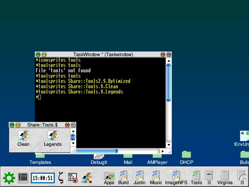
ToolSprites
The ToolSprites had, occasionally, been a source of complaints from users. Mostly by those who wanted to customise the style of the desktop when the tools weren't quite as flexible as they would like. In many cases, the window furniture was suitable for most users. However, I believed that - based on my own experience, and some comments from others - there were some areas that should be improved.
Ordering
Initially, I started by focusing on the most obvious changes that could be implemented to make the furniture more flexible - moving the close icon to the right of the title bar, instead of the left. This is closer to the configuration used by Windows, so would (I believed) ease any transitions between systems. The iconise button was also moved to the left side, and the order of the title bar completely reversed - all three under different compile time options.
This was pretty successful, with each of the icons working as expected in their new locations. However, these options couldn't be compile time specific - they needed to be dynamic. And why should I determine the ordering of the tool set ? Surely there must be other configurations that people might want to use that just haven't been used by other people ? Having the whole ordering configurable would give far greater flexibility.
The ordering of the ToolSprites around the window is defined by a table, which happens to be hard coded - this was the table manipulated by the compile time switches. Generating the table to match a configurable definition should be pretty simple. I set out to do so using a little bit of C code that took a simple description and produced a table suitable for use in the Wimp. The small application had a simple interface to plot coloured rectangles in the order specified by the table, allowing very quick testing of different styles, to check that the tables constructed were both valid, and did what was expected.
As usual, this way of building the functionality and testing it was significantly easier and more reliable than writing the code directly in the Wimp. Once I was happy with both the command line format used to define the tool ordering, the code was integrated into the Wimp itself. Together with a new *Command - WimpToolOrder - which allowed the order to be configured.
There will always be some restrictions of how the tools work, but the ones that I allowed were some of the more unlikely combinations. For example, trying to place the horizontal scrollbar and titlebar in the same place doesn't work. On the other hand, placing the titlebar at the bottom of the window does work, as does placing the vertical scrollbar on the left of the window. One minor frustration that I never addressed was the resize icon - whilst it can be placed anywhere, it always moves the bottom right corner of the window. "A minor set back", as Evil The Cat might say.
The configuration could produce some useless orderings though. You could place all the tools (except the title and horizontal scrollbar) on the right of the window, in the vertical scroll bar. Which is fine, except that if the window doesn't have a vertical scroll bar, none of the icons will appear at all.
One small problem the tool sprite ordering showed up was that the 'toggle size' icon's width was expected to be the same as the width of the 'vertical scroll bar'. If it wasn't, things wouldn't come out right. It was relatively easy to fix, though.
Whilst I was playing with it, I decided to try an experiment with the ordering of Iconbar and the tools. The 'flipped' desktop is a little strange - and in looking for the screenshots from the past I found an image of it...
Rendering
The tool sprites are actually drawn slightly differently under RISC OS 4 than under earlier versions. Instead of being plotted transparently, with the colour of the window furniture showing through from below, the greys in the tools are blended towards the window colour - usually the cream window focus. This looks pretty good most of the time.
However, when the deep sprite support was added - using the wide colour translation tables and colour maps - it was possible to extend this to the ToolSprites. Actually, it wasn't so much 'possible' as 'necessary', as the code is highly shared. It is a little too shared really, but I retained a lot of that as the shared code did help. It meant, though, that the ToolSprites should be able to be deep sprites now - previously they could only be up to 256 colours.
The changes in behaviour had, under some experimental builds of the Wimp, fun effects - tints could bleed through to the tool sprites, so that a green tinted icon (for example) would cause the furniture to become tinted green. Which actually looked quite fun - albeit not that useful.
Older patches
Long before - back in RISC OS 3.1 days - I had tinkered with the WindowManager, making a few small changes. One change was for different styles of icon buttons. In particular, I used the circle segment plotter to draw buttons, giving them nice rounded corners (which didn't quite work because the method I was using was rather rudimentary). Another change that I tried, very shortly before getting a RiscPC, was to make the window border a different colour based on the task that created it. So, for example, Filer windows could have green furniture, !Zap windows could have blue furniture, and other applications might appear in grey.
The patch was successful, but it was just a hacky little patch and not even
tidy enough to show anybody really - I think Chris saw it, but it wasn't
worth much. The tinting of the tools reminded me of that old patch, and I had
intended to return to that as a possible SWI Wimp_Extend API extension
in the future. Sadly, I never got around to it  .
.
Disclaimer: By submitting comments through this form you are implicitly agreeing to allow its reproduction in the diary.